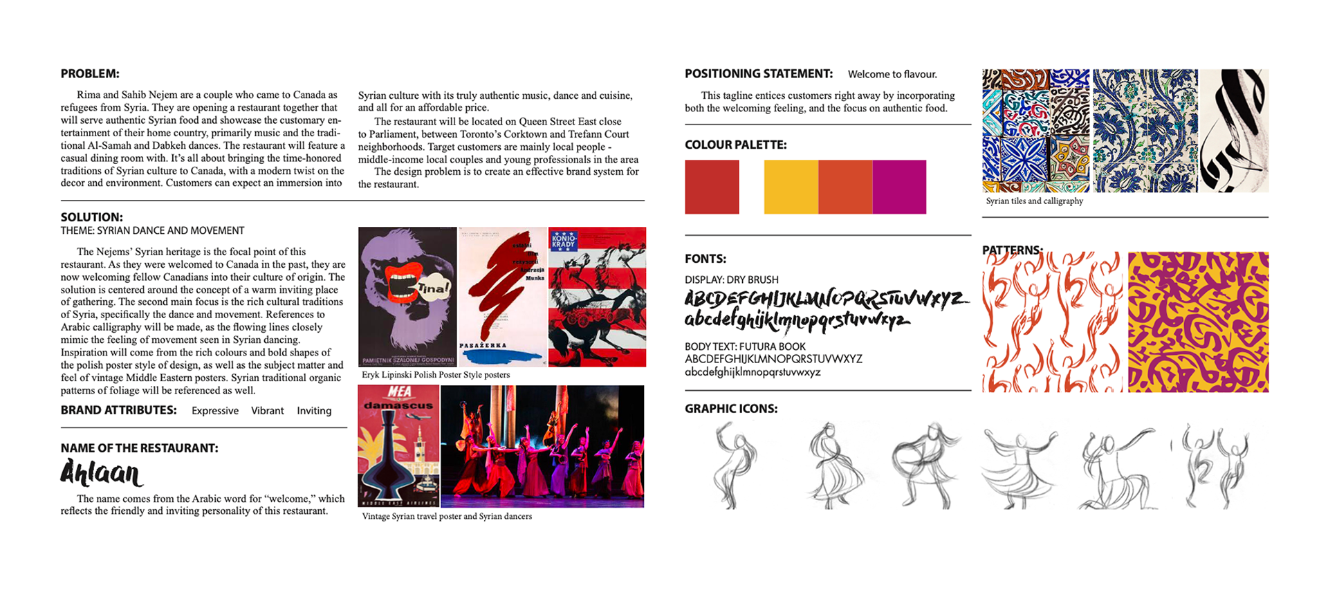

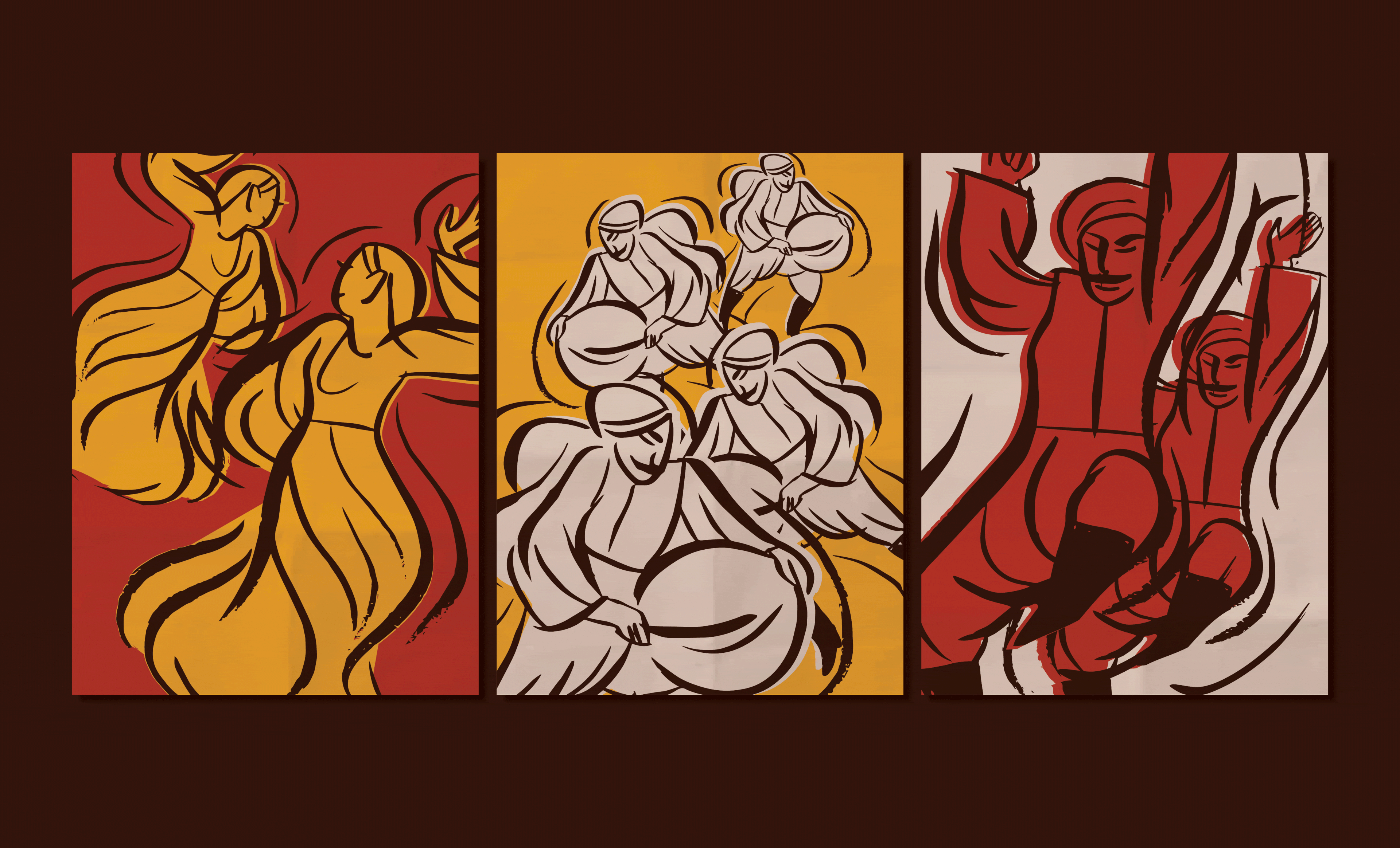
Ahlaan, meaning "welcome" in Arabic, is a family-centred restaurant whose identity is built around Syrian cultural heritage. The look and feel of the brand uses gestural illustration to pay homage to dynamic traditional dance, the visual movement of Arabic calligraphy, and the rich warm colours of the Middle East.
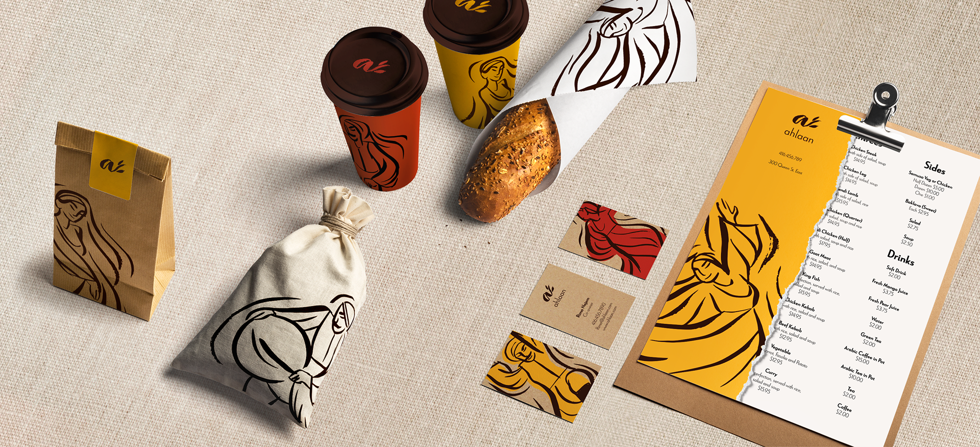
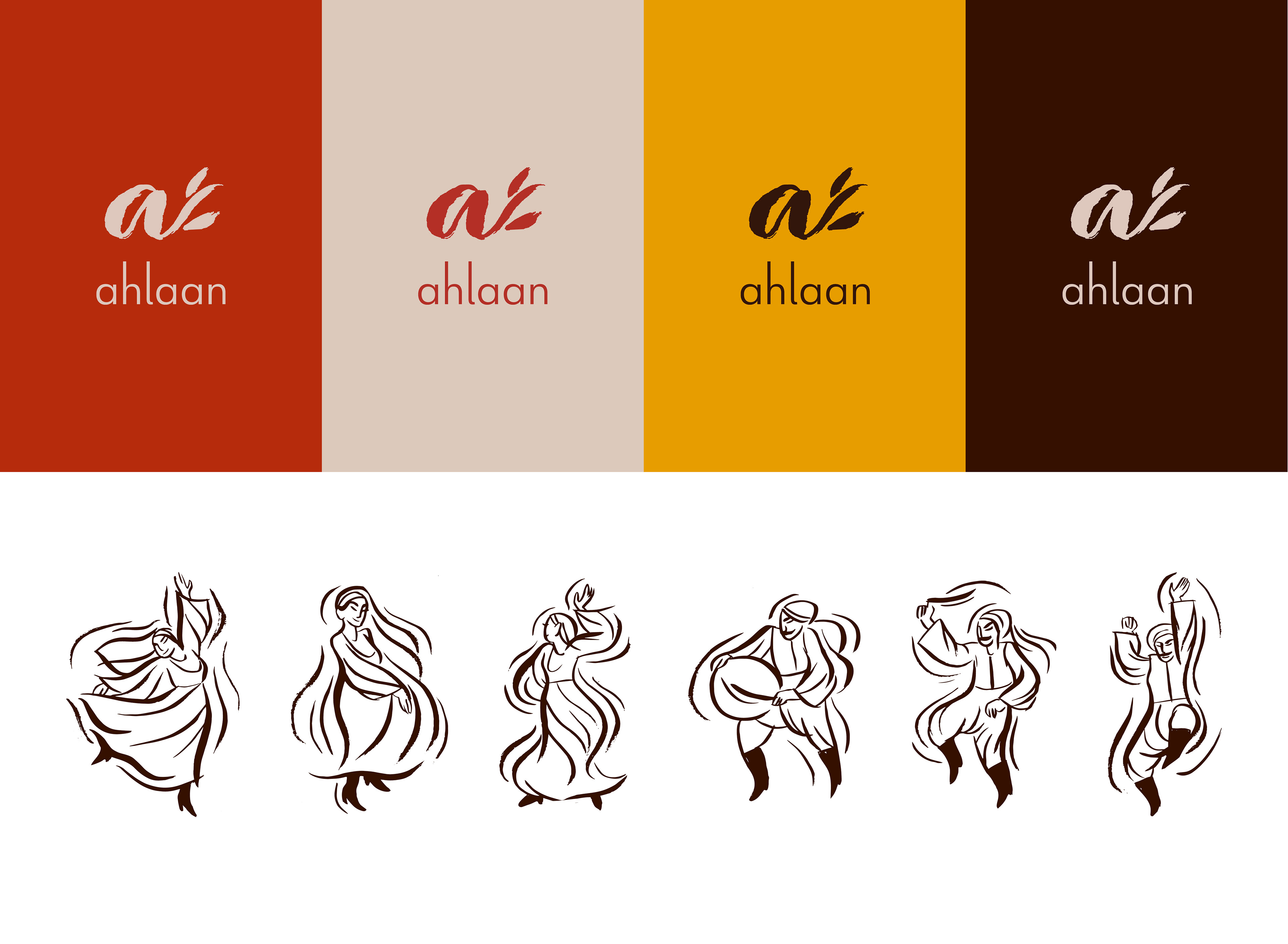
I used natural textures and materials combined with the hand-drawn brush illustrations to evoke an authentic, down-to-earth feeling. The colours are a balance between vibrant and spicy, and muted and earthy.
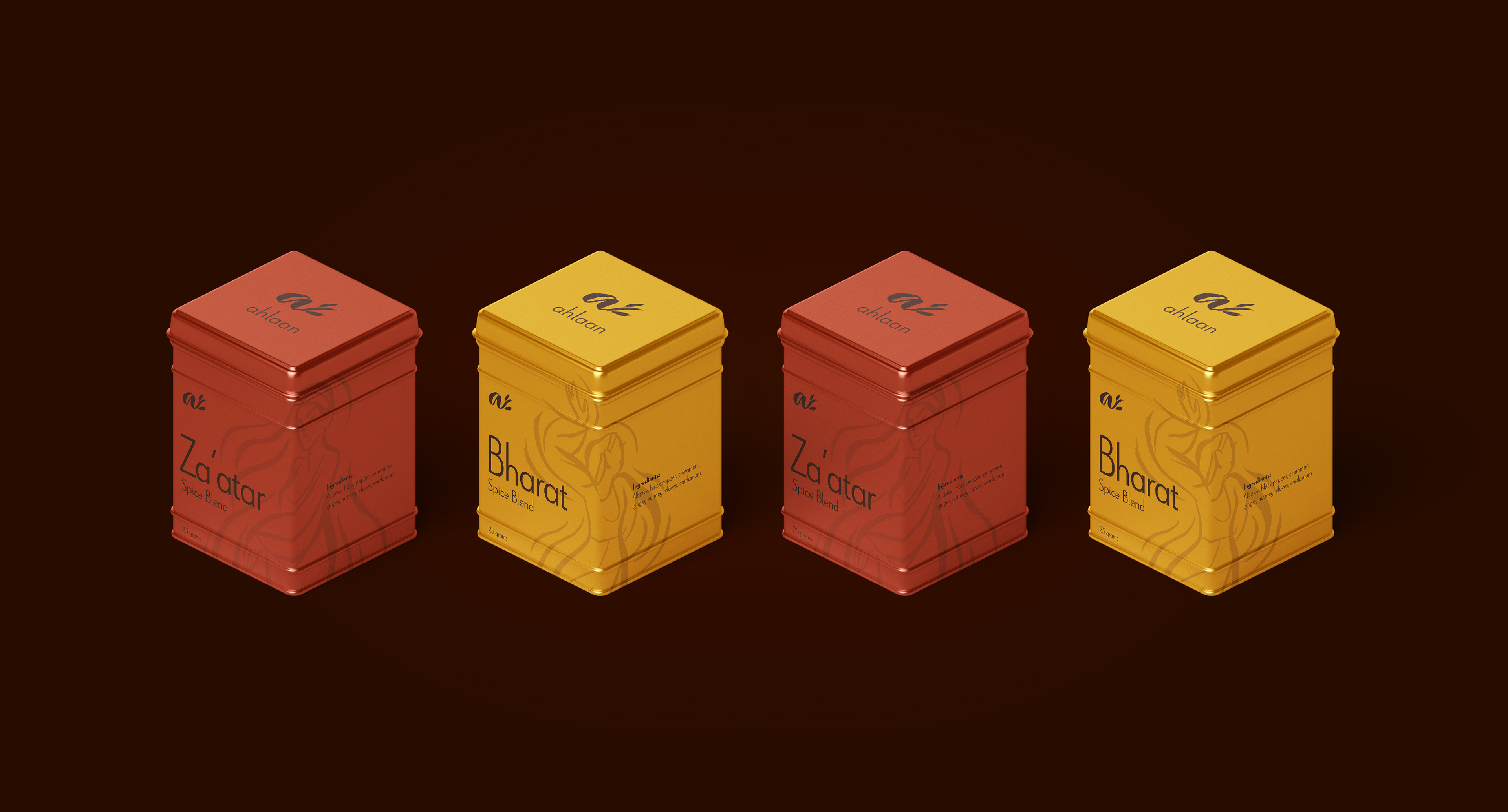
As the main graphic element of the brand, the dancer illustrations are almost used as an abstract pattern. They are a reference to traditional Syrian culture while providing movement, texture and visual interest.

This project was completed in my last year of design school. The process included many iterations of research, gathering inspiration, conceptualizing, and ideation. This meant all my design choices were grounded in purpose and functionality, allowing the identity to expand with the brand.