
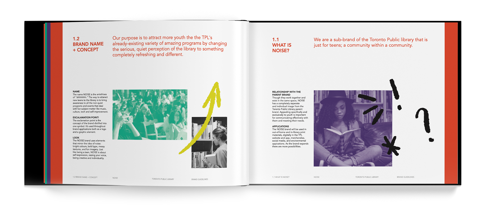
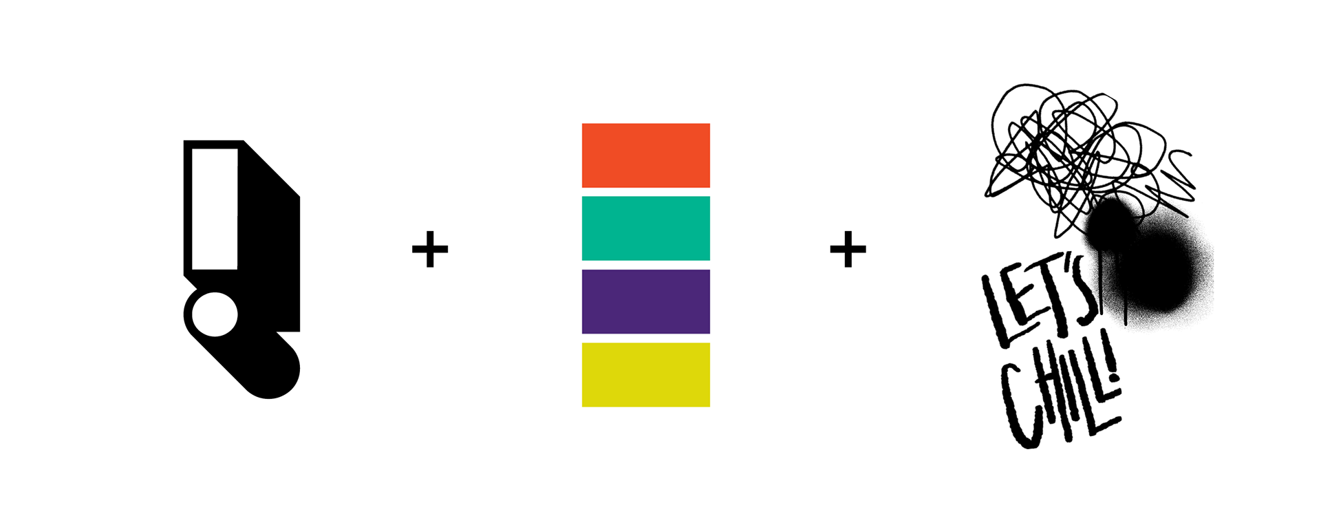
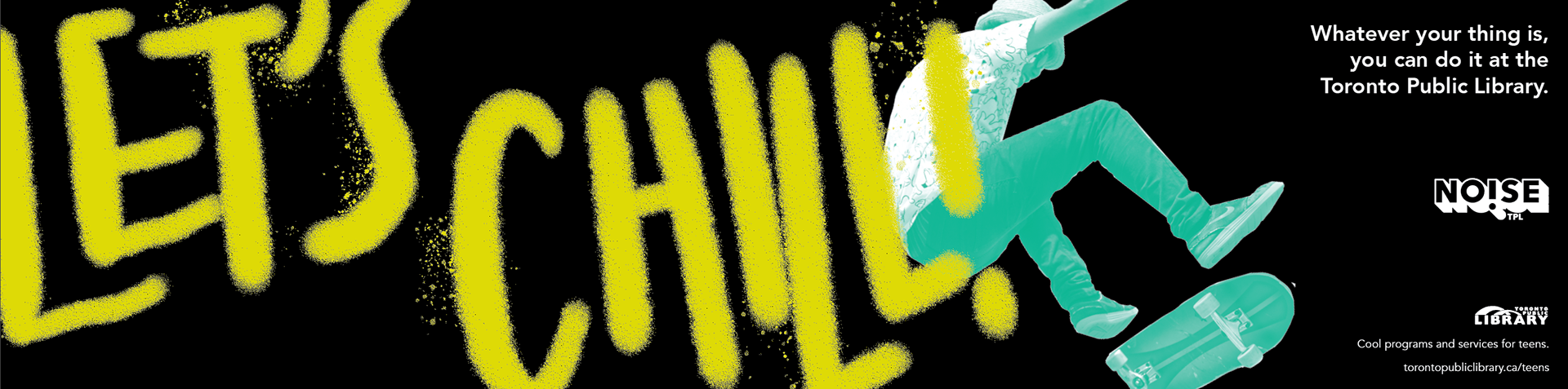
NO!SE is a concept for a Toronto Public Library sub-brand that is just for teens. NO!SE destroys negative perceptions by tapping into the exact opposite of the traditional library image. Instead of plain, it's maximalist. Instead of bland, its bright and colourful. Instead of quiet, it's loud! With bold imagery and a youthful personality, NO!SE will actually get teens excited to participate in public library programs.
This project was a huge learning experience as it included extensive research, strategy, and ideation that spanned two semesters. Take a look at the research process behind this project at this link.
Thesis advisor: Paul Haslip.
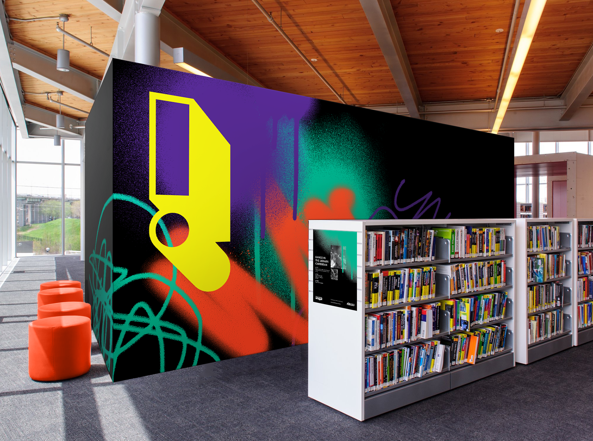

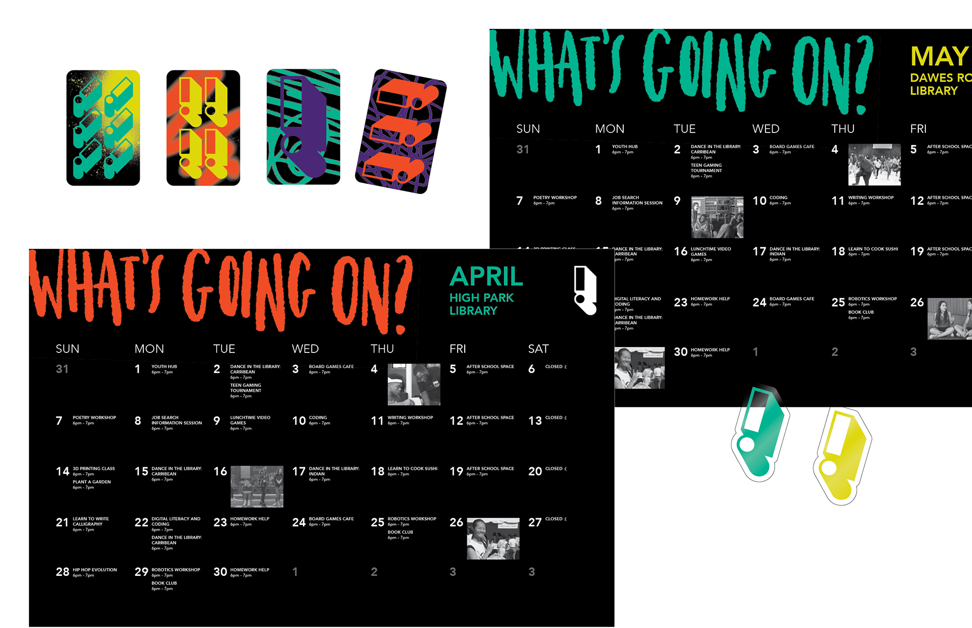
The brand identity is made up of two main elements: the exclamation point symbol and the graffiti-inspired imagery, all in a bright colour palette. This allows it to be able to be customized into endless variations and templates, and with potential to expand in the future. As the Toronto Public library is a huge organization, the brand book is key. It outlines guidelines to keep the brand cohesive among all its potential touch points, as well as possibilities for how it can be used creatively.
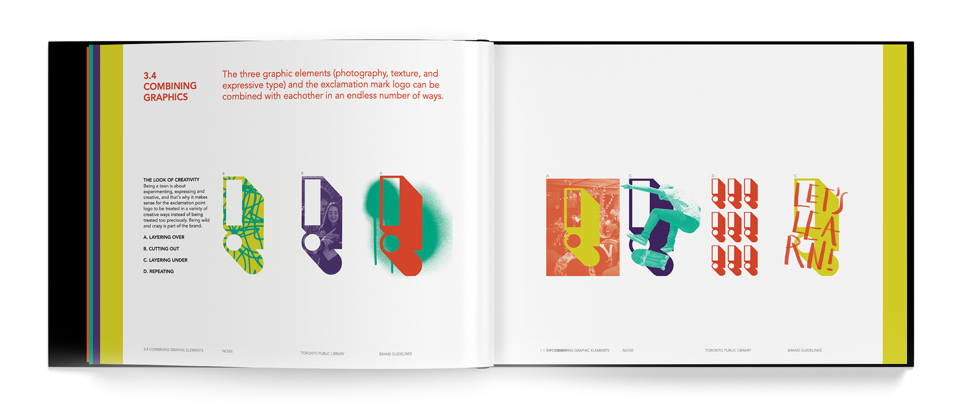
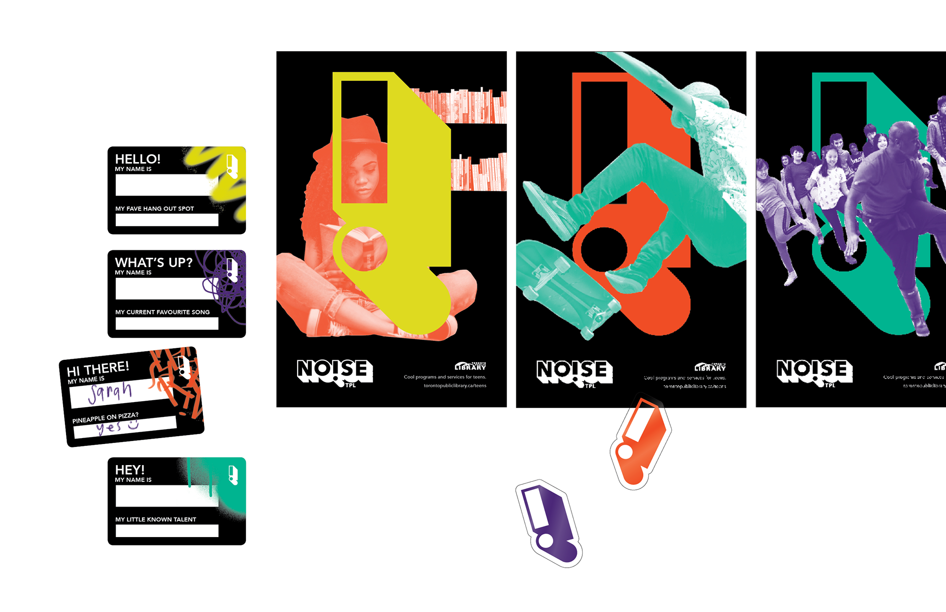
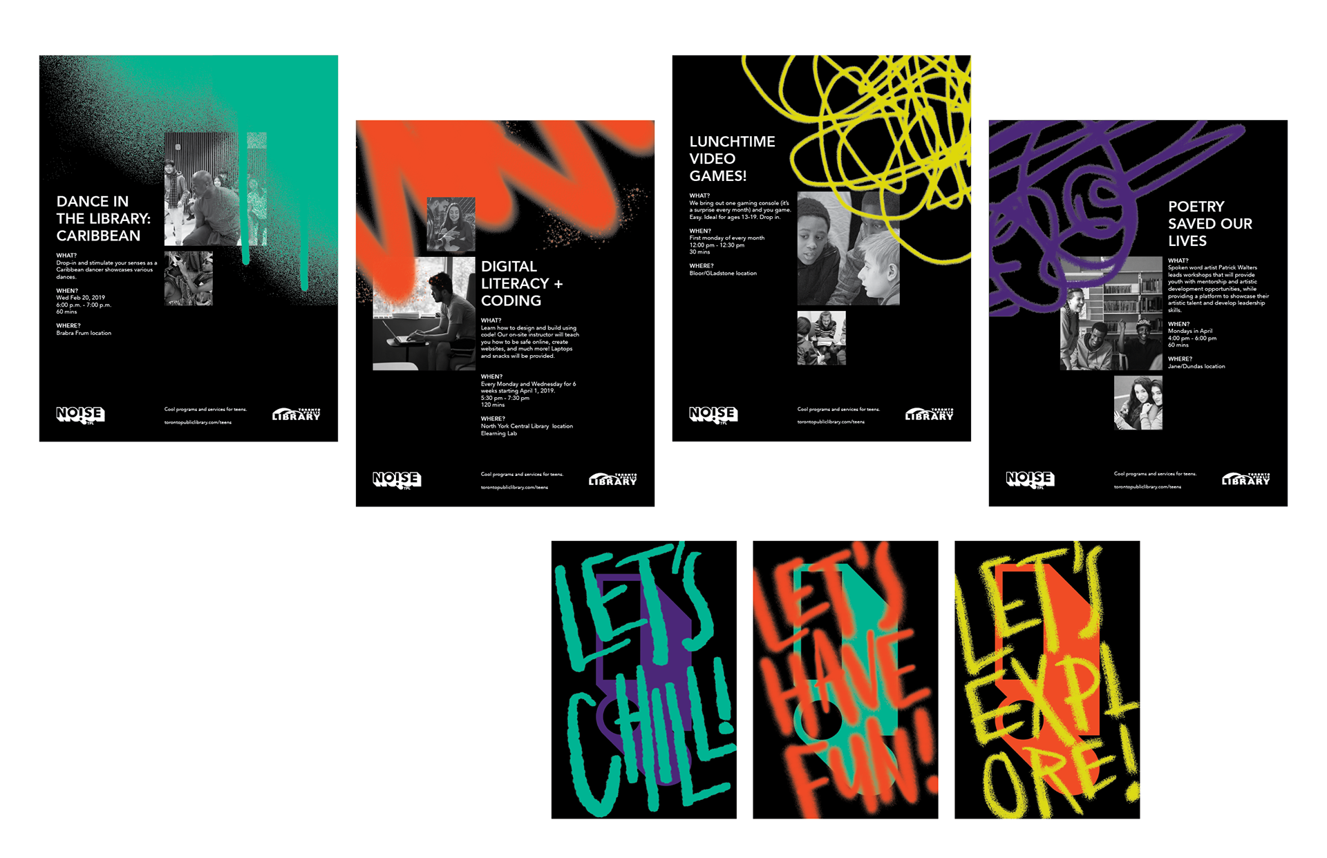
The brand includes in-library customizable assets such as calendars, posters, brochures, name tags, cards, stickers, as well as a hand-written typeface. A strong grid layout and clean typography provide balance with the energetic, off-the-grid graphics.
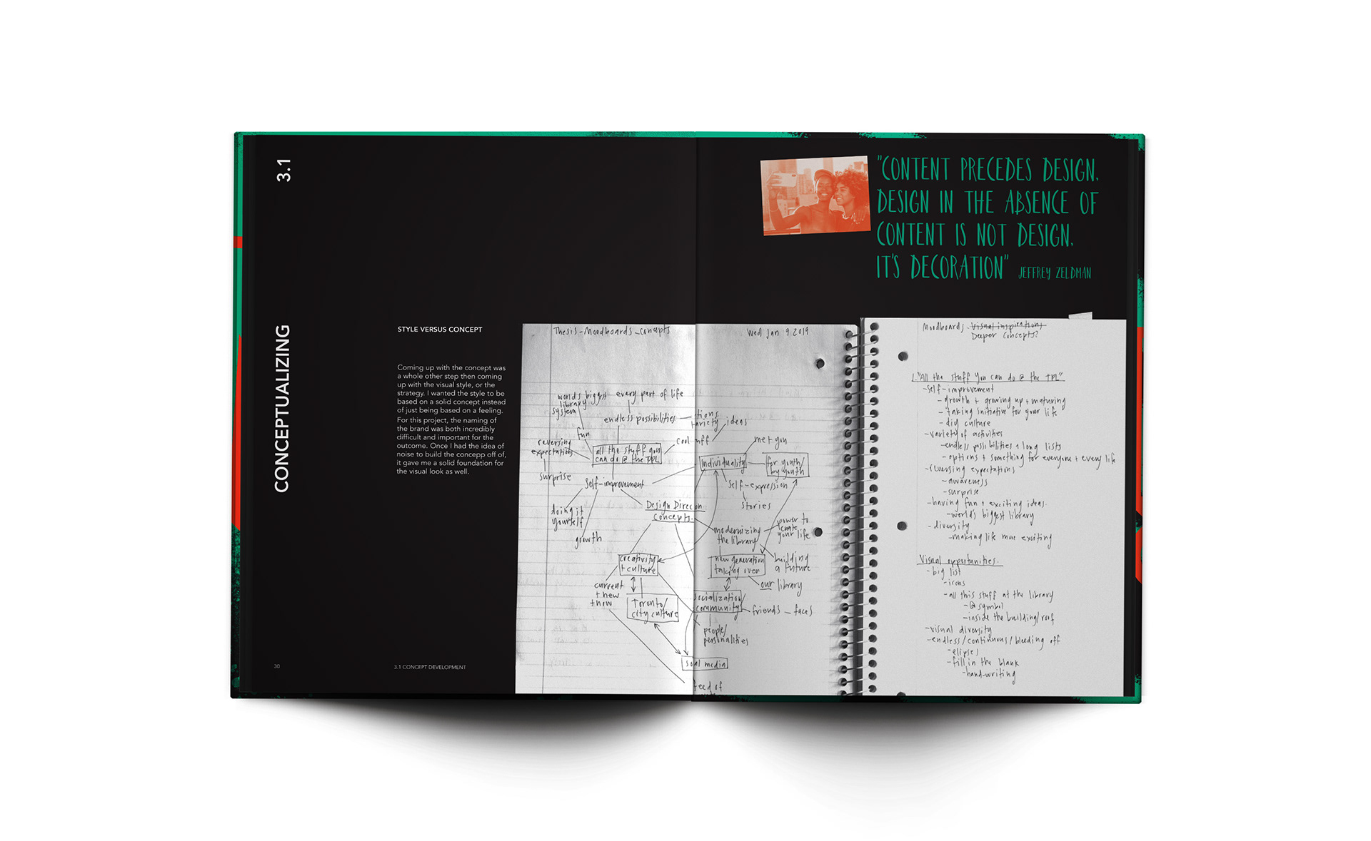
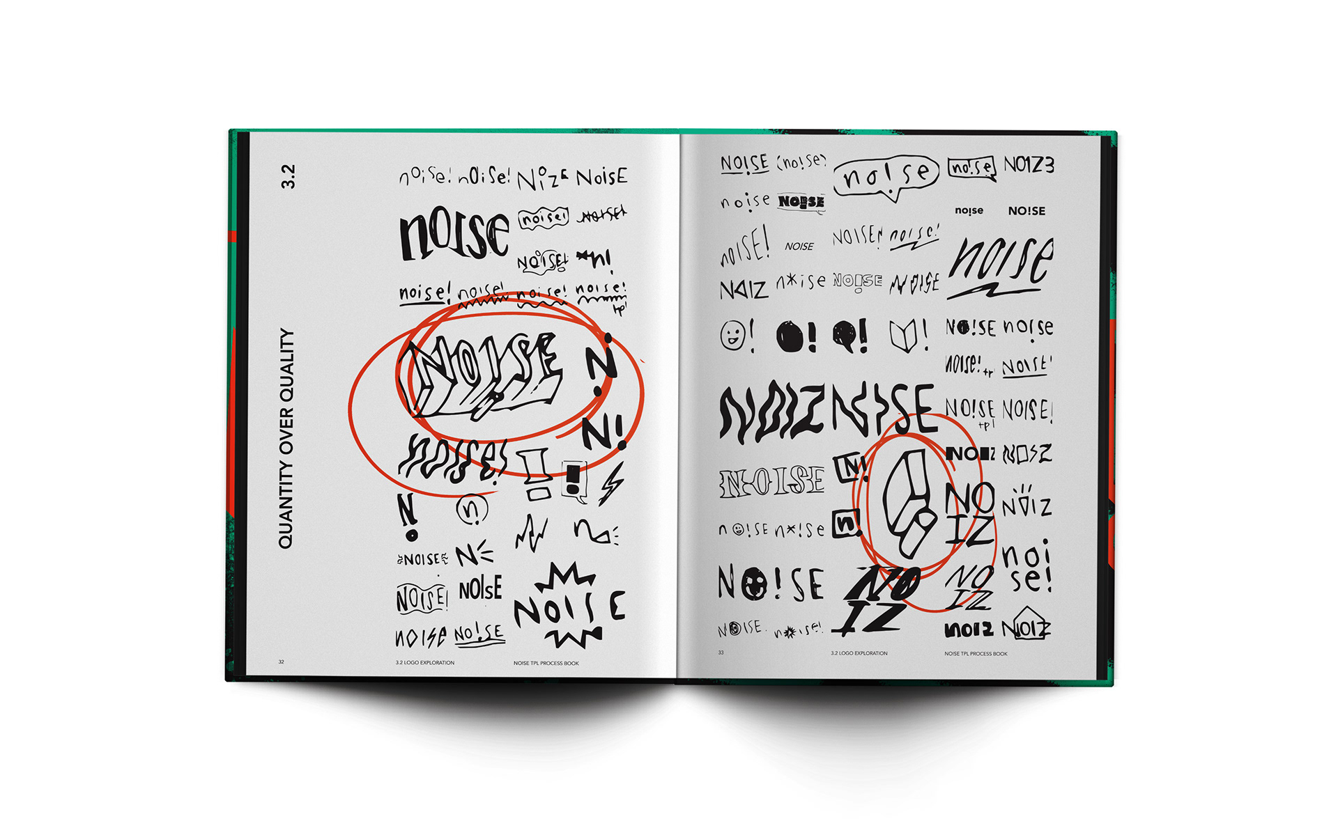
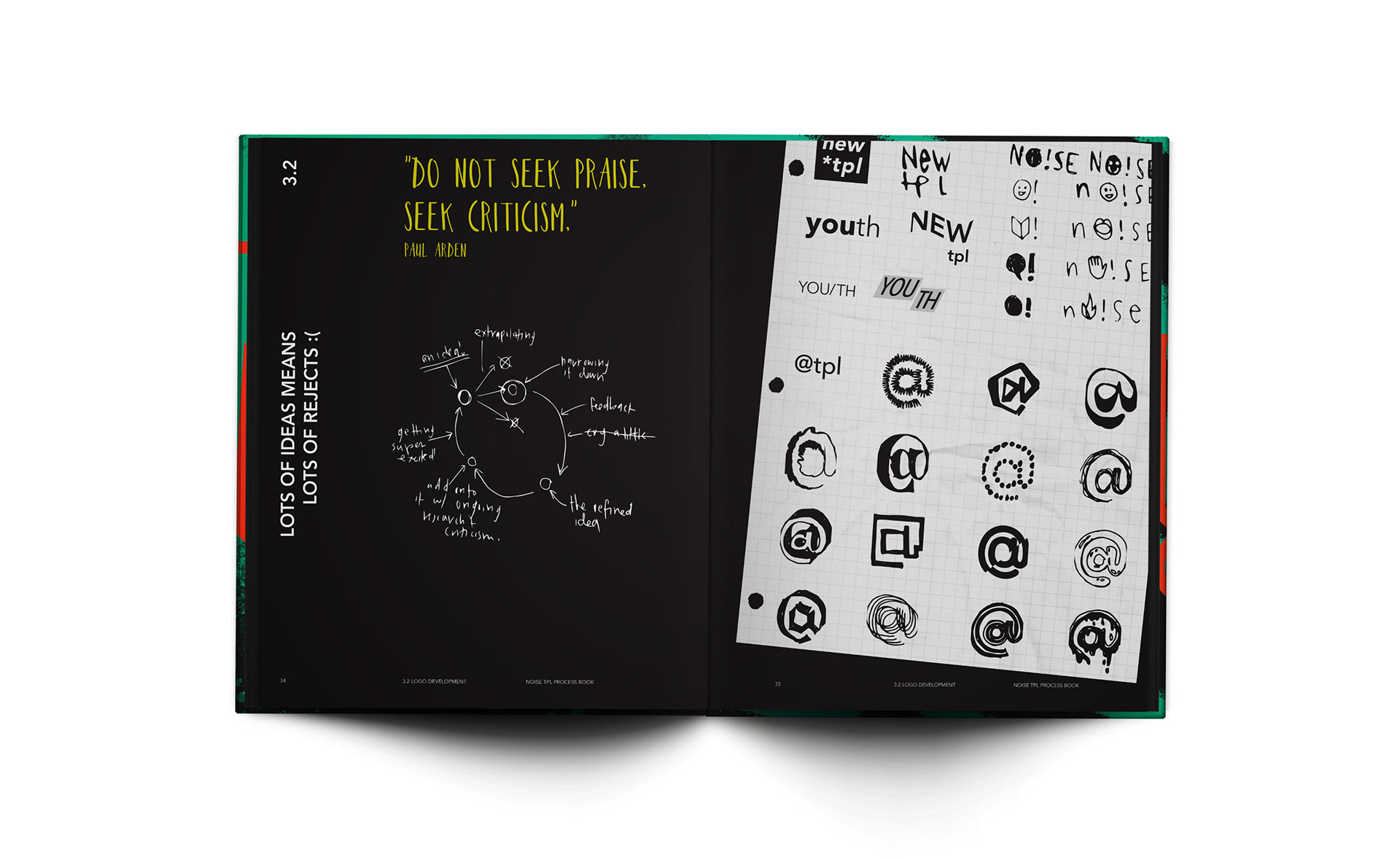
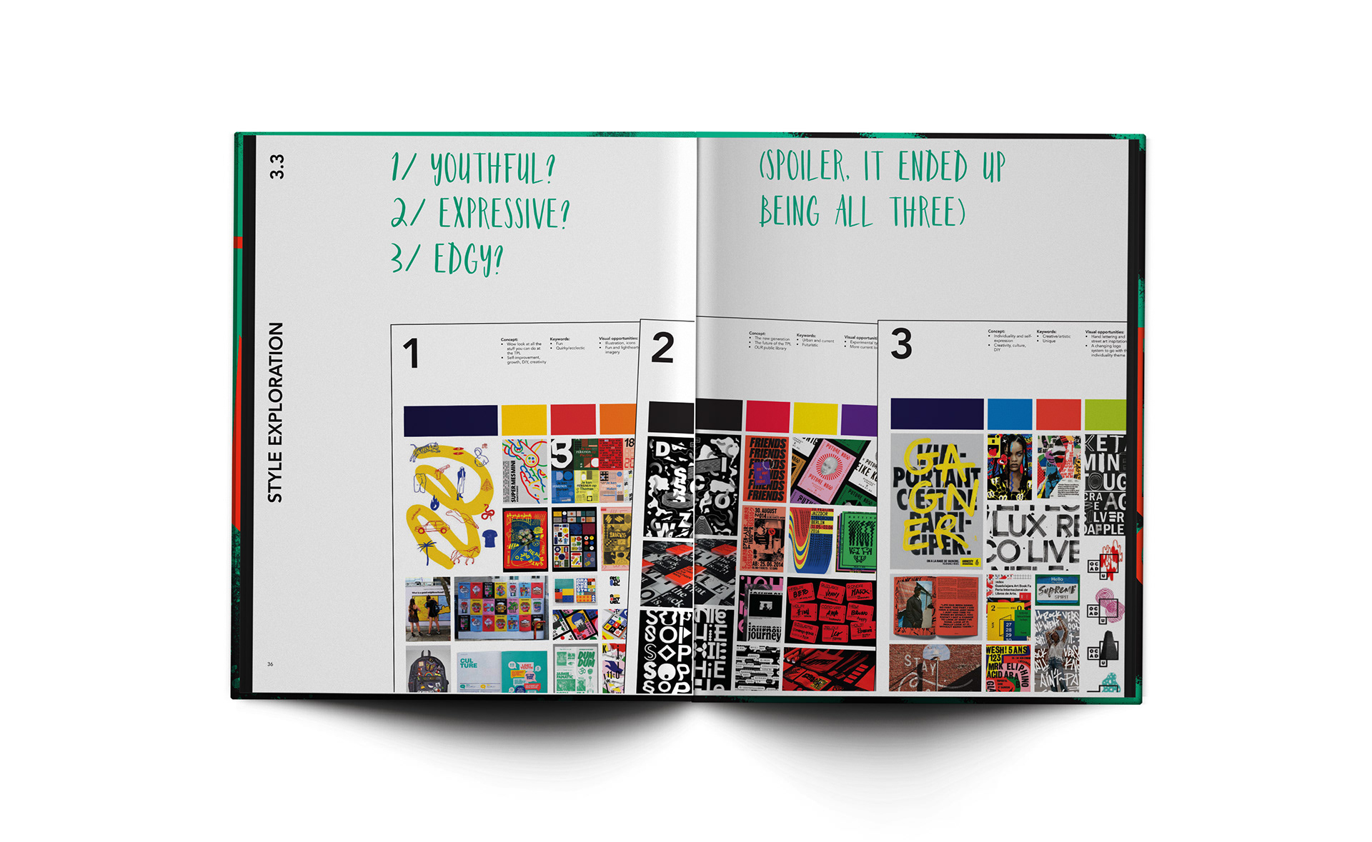
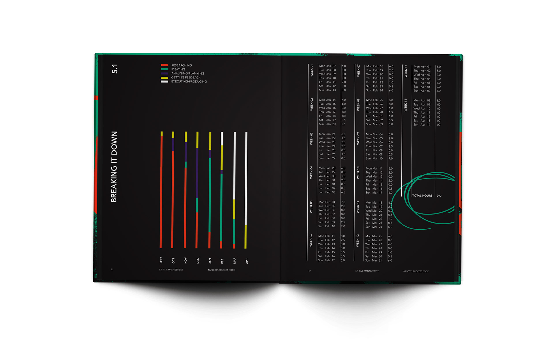
The process book was one of my favourite parts of this whole project. It contains the entire timeline of this project including research, interviews, moodboards, sketches, ideation, and more.