

Here’s a brief case study on how a few strategic changes transformed a design’s effectiveness. I was hired to revamp editorial ads for an infrastructure company featured in an industry magazine.
First, we’ll examine the issues with the original ads, followed by the updates that enhanced the design.
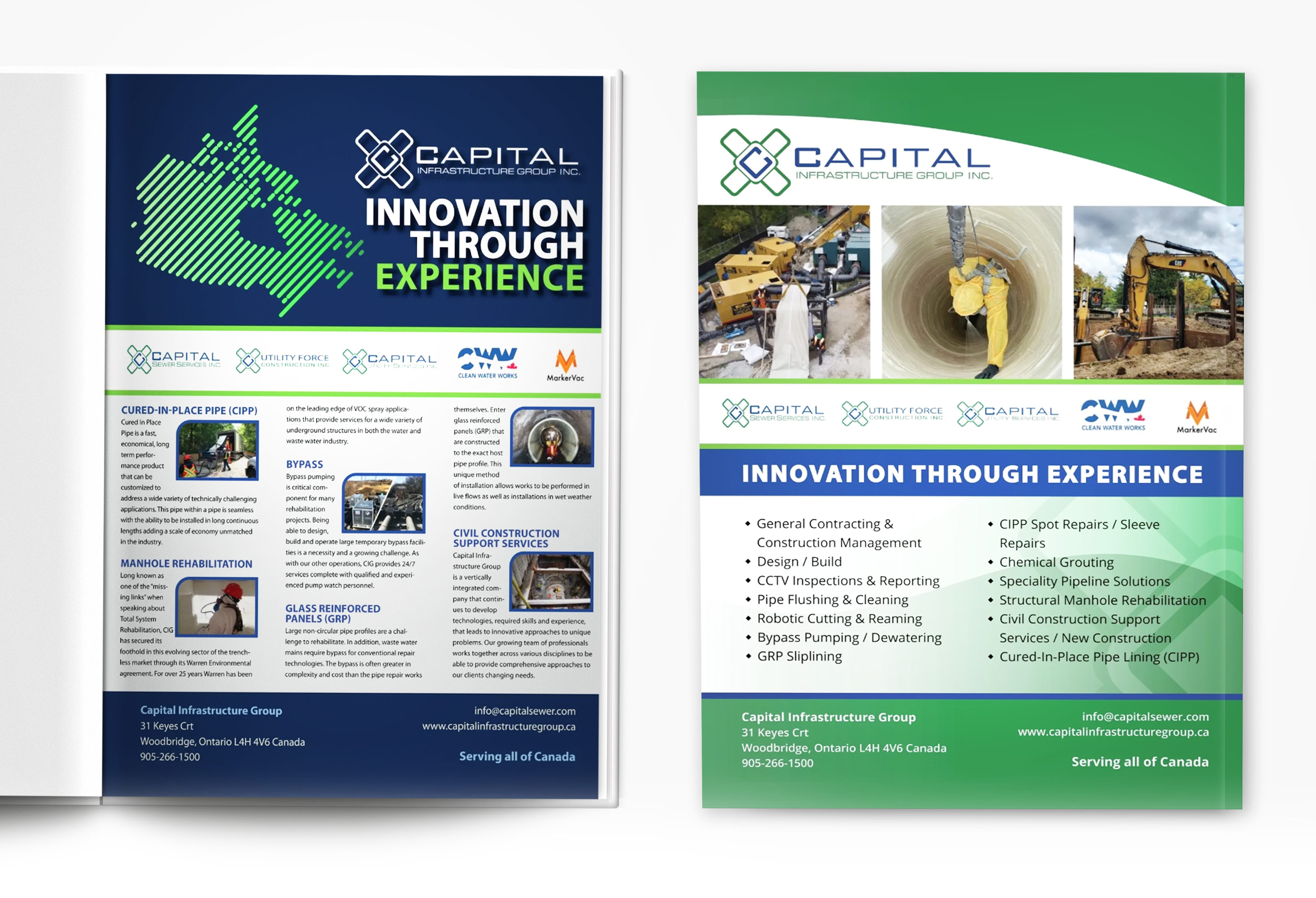
BEFORE (above)
Unclear visual hierarchy: There’s minimal contrast between elements, making it difficult for the eye to focus. This lack of direction may overwhelm viewers and deter them from engaging further.
Inconsistent brand identity: The ads suffer from inconsistent colour use, typography, and layout. Aside from the logos, they don't immediately appear to be part of the same brand.
Unprofessional look and feel: Not enough breathing room and disjointed sections give the ads a slightly dated impression.
Ineffective layout: The left page resembles an article more than an ad, and the images are too small to be impactful. The layout needs a purposeful narrative to quickly convey the desired message to readers.
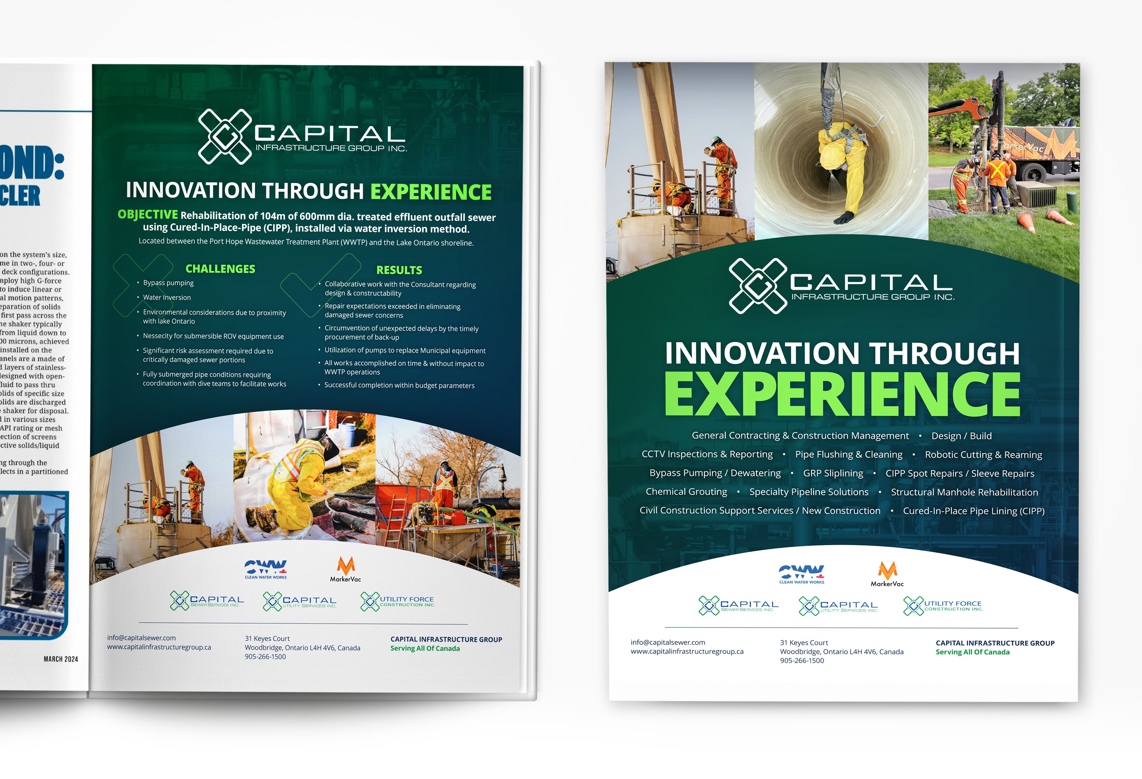
AFTER (above)
Strong hierarchy: The ads now share a cohesive design, with unified color, typography, and layout. This consistency reinforces brand recognition, helping viewers instantly connect the ads as part of a series, increasing their impact.
Consistent brand identity: Both ads now use a variation on the same design, meaning colour, typography treatment, and layout are now all within the same visual family. The viewer will immediately know this is a follow-up to the ad they saw earlier, and this visual repetition will increase the sticking power of the ads.
Professional look and feel: The updated design is clean, modern, and strikes a balance between bold and refined, making it more representative of the business. Improved colour contrast, carefully selected images, and a subtle gradient background enhance visual interest without distraction.
Well-considered layout: The layout now reads like an ad, not an article. Information is grouped in dynamic shapes rather than straight boxes, creating movement and guiding the eye naturally through the page.
Overall, the ads are visually appealing, stand out better in the magazine, and convey a polished, positive impression of the company.